
Why 100% K prints grey, and the exact CMYK rich-black recipe for a deep, saturated black — without registration or total-ink-limit problems.
Rich Black and Pure Black in CMYK
Why does the black background of a premium catalogue cover look deep and velvety, while the same "black" on another cover comes out grey and flat? Both files are "black" — but they are not the same black. The difference lies in how you defined black in CMYK.
In this guide we will explain when to use pure black, when to use rich black, what total ink coverage (Total Ink Limit) means, and why some "solid" blacks actually wreck the print.
Why 100% K Looks Grey in Print
A single layer of black ink on white paper does not block light completely. A small portion of incoming light still passes through the ink film, reflects off the paper and returns to the eye. The result: a slightly "greyish" or "soft" perception — especially across large filled areas.
In offset printing there is also a second factor. Even at a 100% screen value, the actual surface coverage is around 95–98% — between the micro-dots there are tiny gaps that the eye reads as overall lightening.
The fix is simple: we add layers of the other three colours under the black to block more light. That is rich black.
Pure Black: 0-0-0-100
Pure black uses only the K plate. Suitable for:
- Body text (legible, no plate-registration issues)
- Thin lines and fine details
- Small icons and pictograms
- Charts and infographics with fine elements
- Large filled areas — look grey and flat
- Premium covers and luxury packaging — lacks depth
Rich Black: Recipes and Nuances
At Spektar we use several rich-black recipes, depending on the effect we are after.
Standard rich black (universal)
C: 60 — M: 40 — Y: 40 — K: 100 — total coverage 240%
This is our recommended recipe for most cases. Gives a neutral, deep black with no visible cast — suited to corporate materials, backgrounds, logo variants.
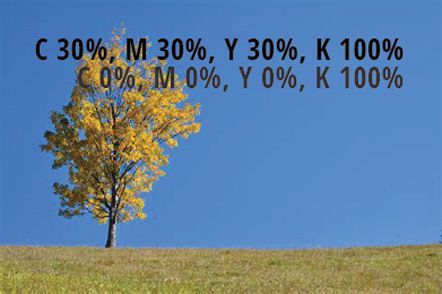
Light composite black
C: 30 — M: 30 — Y: 30 — K: 100 — total coverage 190%
A more economical option that still looks noticeably denser than pure black. Useful on uncoated stocks or when you have to be careful with the TIL.
Warm black
C: 0 — M: 30 — Y: 30 — K: 100 — total coverage 160%
No cyan, just magenta and yellow under the black. Gives a slight brown, "warm" cast. Suited to:
- Food products and culinary catalogues
- Boutique wine labels
- Warm design concepts (autumn, coffee, wood, leather)
Cool black
C: 60 — M: 0 — Y: 0 — K: 100 — total coverage 160%
Only cyan under the black — creates a slight bluish, "cool" cast. Looks modern, technological, "premium". Suited to:
- Tech products
- Luxury electronics packaging
- Fashion and perfume catalogues
Never use C:100 M:100 Y:100 K:100 (total 400%) or Registration Color for design elements. The press cannot dry that much ink — sheets will stick together and the blanket cylinders will get contaminated.
Total Ink Limit (TIL) — Total Ink Coverage
Different papers and standards allow different maximum sums of the four inks. If your file exceeds the limit of the paper being printed on, the ink will not dry in time — the result is set-off (printing onto the back of the next sheet), picking, smearing, or even press blocking.
| Standard / profile | Paper type | Maximum coverage |
|---|---|---|
| FOGRA39 (ISO Coated v2) | Coated gloss or matte | 330% |
| FOGRA39L (ISO Coated v2 300%) | Coated, reduced version | 300% |
| FOGRA51 (PSO Coated v3) | Coated gloss or matte | 300% |
| FOGRA52 (PSO Uncoated v3) | Uncoated | 300% |
| FOGRA47 (PSO Uncoated) | Uncoated | 260% |
| ISOnewspaper26v4 | Newsprint | 240% |
| SWOP (US) | Web offset | 300% |
| GRACoL (US) | Premium sheet | 320–340% |
Practical reference: if you don't know the exact standard, a total coverage up to 280% is safe in most cases on coated stock, and 240% on uncoated.
Quick check in Photoshop
Window → Info → click the eyedropper → Color Readout → CMYK + Total Ink
Now when you hover over a dark area, you will see the sum of all four inks. If it exceeds the limit anywhere — that area needs correcting.
When NOT to Use Rich Black
- Body text — at small sizes, rich black causes visible colour halos due to micro plate misregistration on press. Always use 0-0-0-100 for text below ~24 pt.
- Thin lines (under 1 pt) — same reason. Even a perfectly tuned press has a tolerance of 0.05–0.1 mm between plates.
- Reversed white text on a black background at small sizes — even a slight shift creates coloured "fringes" around the letters.
- Printing on uncoated paper with high dot gain — rich black easily exceeds TIL and creates wet patches.
Common Client Mistakes
"Black" from Microsoft Word and PowerPoint
When you export a PDF from an Office application, the text is technically RGB black (0, 0, 0). On conversion to CMYK you often get a rich black around 75-68-67-90 — depending on the profile. This can cause issues with small text and legibility on press.
Fix: for professional design, always use Adobe InDesign, Illustrator or Affinity, where you can set 0-0-0-100 directly for text.
Logos with "black" from web versions
A logo downloaded from the client's website often has a colour like RGB(20, 20, 20) — close to black, but not exactly. After CMYK conversion, you get a muddy grey-brown that never reaches a satisfying dark on press.
Fix: always ask for the original logo from its design package (.ai, .eps, or vector .pdf).
Scanned photos with a "black" background
Scanned or photographed black objects in RGB usually have a "black" that is really dark grey (around RGB 25, 25, 25). Without a black-point correction during CMYK conversion, the result is grey, not black.
Fix: in Photoshop — Image → Adjustments → Levels → drag the black slider to the start of the histogram to restore the true black point.
Digital Printing: Softer Rules
In digital printing (HP Indigo, toner machines, UV printers) the gap between pure black and rich black is smaller. Toner is far more opaque than offset ink, and there are no plates to misregister.
- For HP Indigo — 100% K already gives a good result, but 60-40-40-100 is still richer
- For toner printers — 100% K is usually entirely sufficient
- For UV print on non-paper substrates — follow the specific guidance for the machine and substrate
Quick Check Before You Send the File
- Small text and thin lines are 0-0-0-100
- Large black areas are rich black (60-40-40-100 or your preferred variant)
- No area exceeds the TIL of the chosen paper
- The file is in CMYK mode, not RGB
- The colour profile is embedded in the PDF (FOGRA39, FOGRA51, etc.)
- Black overprint settings are checked (extra care with large rich-black elements)
- Don't use C:100 M:100 Y:100 K:100
- Don't use Registration Color anywhere except registration marks outside the trim
- Don't let Word/PowerPoint text through without checking its black value
- Don't trust the "black" in web versions of logos
Summary
| Use case | Recommended black |
|---|---|
| Body text (under 24 pt) | C:0 M:0 Y:0 K:100 |
| Headlines (large, bold) | Rich black C:60 M:40 Y:40 K:100 |
| Full-page black backgrounds | Rich black C:60 M:40 Y:40 K:100 |
| Thin lines | C:0 M:0 Y:0 K:100 |
| Premium covers and packaging | Rich black or custom mix |
| Food / warm designs | Warm black C:0 M:30 Y:30 K:100 |
| Tech / premium products | Cool black C:60 M:0 Y:0 K:100 |
| Digital printing | C:0 M:0 Y:0 K:100 (or 60-40-40-100 for more density) |
| Uncoated paper | Light composite C:30 M:30 Y:30 K:100 |
Not Sure About a Specific File?
Send it to us before production. In a few minutes we check total coverage, colour mode and rich-black settings. Better to correct it now than to reprint a finished run.