
Classical AM screening, stochastic FM screening and hybrid approaches each have different strengths in offset printing. What they mean for your print quality and when each technology is the right choice.
AM, FM and Hybrid Screening
Offset printing has one fundamental limitation: the press can either lay ink at a given point, or not. There are no intermediate values — the printing plate does not "know" what 50% grey is. And yet on the cover of a magazine you see smooth gradients from light to dark, perfectly reproduced photos and subtle nuances. How?
The answer is the screen — a technique in which continuous tones are turned into a pattern of microscopic dots that the eye reassembles into a smooth image. The nature of that pattern, however, is not universal. There are several fundamentally different approaches, and the choice between them has a direct impact on sharpness, tonal range and the risk of moiré in the final product.
What the Eye Actually Sees
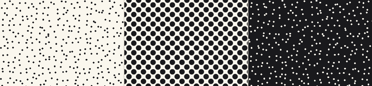
When you look at a printed magazine from 30 cm away, your eye does not resolve the individual screen dots — they are too small and merge together. But under a loupe or microscope the pattern becomes clearly visible. Then you can see whether the screen is periodic (the dots are on a regular grid) or stochastic (the dots are scattered at apparently random positions).
This distinction is the foundation of the two main screening technologies.
AM Screening — The Classic
AM (Amplitude Modulated) screening places the dots on a fixed grid. The size of each dot varies according to the tonal value of the image in the corresponding area:
- Highlights → small dots
- Shadows → large dots
- 50% tone → dots whose area fills half their cell
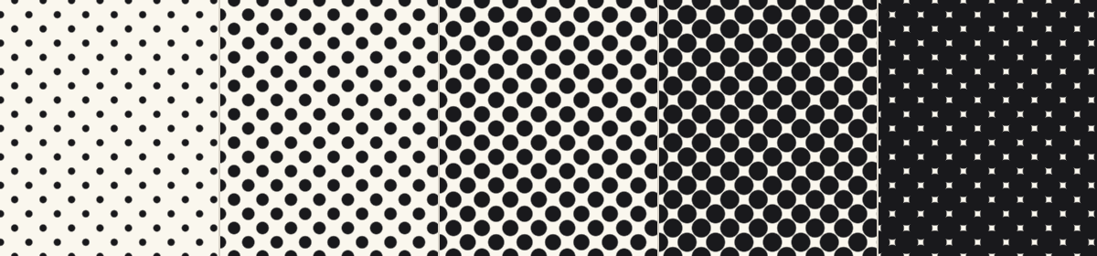
Characteristics
- Screen ruling: 150–175 lpi on coated paper, up to 200 lpi for premium reproductions
- CMYK screen angles: C: 15°, M: 75°, Y: 0°, K: 45° — chosen to minimise interference between plates
- Characteristic rosette — visible under a loupe, when the angles are correctly set
Advantages
- Stable and predictable — a technology refined over decades
- Lower dot gain
- Easy to calibrate and reproduce
- Suitable for everything from newsprint to premium catalogues
Disadvantages
- Visible structure at low screen rulings (newspapers)
- Risk of moiré on fine textures — fabrics, meshes, threads, parallel lines
- Requires strict adherence to the screen angles
FM Screening — The Stochastic
FM (Frequency Modulated) screening, also called stochastic screening, uses dots of fixed size at apparently random positions. Darker areas contain more dots per unit area; lighter areas contain fewer.
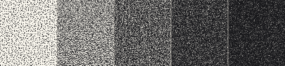
Advantages
- No moiré at all — there is no regular grid to interfere with textures
- Extremely fine detail — especially on hair, skin, fabrics and subtle gradients
- No visible screen angles, regardless of direction
- Screen rulings equivalent to 250–300 lpi AM are achievable
Disadvantages
- Higher dot gain — every small dot has a high "edge-to-area" ratio
- More demanding on the press's ink/water balance
- Slight grainy look in single-colour solid tones and around 50%
- Less stable on long runs — requires more frequent checks
AM and FM Side by Side
At the same tonal value (50%) the difference in pattern is dramatic. AM lays the bulk of the dots on regular rows and columns with a characteristic rhythm; FM scatters them, with no visible regularity.
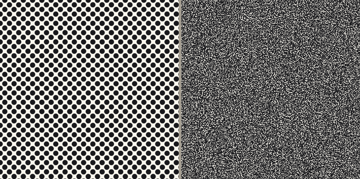
The Rosette — The Signature of Offset
In CMYK printing, the four screened plates are printed at slightly different angles (C: 15°, M: 75°, Y: 0°, K: 45°). When they overlap, the dots form a characteristic pattern called the rosette. It is the visual signature of offset printing.
The recognisable "dot structure" of a printed magazine or catalogue is exactly this rosette. With FM screening there is no rosette — the dots are scattered without a regular grid, which is also why FM looks visually cleaner.
Hybrid Screening — Best of Both Worlds
Each of the two technologies has specific weaknesses:
- AM in very light tones (below 3–5%): the screen dots become so small that the press reproduces them unstably or loses them entirely. The result is "washed-out" highlights without modulation.
- AM in very dark tones (above 95%): the white "holes" between the screen dots become tiny and fill in with ink. Shadows become flat black, with no detail.
- FM in midtones: dots are stable, but in smooth areas (sky, skin, gradients) a slight graininess appears compared to a fine AM screen.
Hybrid screening combines the two technologies in a single image, using the strengths of each:
- Highlights (0–10%): FM distribution with a guaranteed minimum dot size — stable reproduction, no detail lost
- Midtones (10–90%): AM — smooth, predictable tonal gradients, no graininess
- Shadows (90–100%): FM distribution with a guaranteed minimum hole size — stability even in the darkest areas
On the Heidelberg system (Prinect Hybrid Screening) we use at Spektar, the minimum dot size in highlights and shadows is adjustable from 2 to 9 pixels — typically 14–30 µm at 2540 dpi platesetting. This guarantees that every dot deposited stays stable across the full length of the run, regardless of how many sheets we print.
We use hybrid screening on runs with critical detail — premium catalogues, art books, fashion publications, cosmetics and perfume packaging.
Dot Gain
However accurate the plate is, the ink spreads slightly on the paper. This difference between the screen value on the plate and the actually printed tone is called dot gain.
| Screen type | Paper type | Typical midtone dot gain |
|---|---|---|
| AM 150 lpi | Coated gloss | 14–18% |
| AM 175 lpi | Coated gloss | 16–20% |
| AM 175 lpi | Coated matte | 18–22% |
| AM 100 lpi | Newsprint | 25–30% |
| FM (20 µm dots) | Coated gloss | 22–28% |
| FM (10 µm dots) | Coated gloss | 30–38% |
This is also why FM screening requires special calibration. Without it, midtones come out too dark — skin tones look "dirty", skies turn lead-grey.
In our prepress, this correction is applied automatically by the RIP, based on the profiles for the specific paper and press.
Which Technology to Choose, When?
| Requirement / product type | Recommended screening |
|---|---|
| Standard commercial print (flyers, leaflets, catalogues) | AM 150–175 lpi |
| Books (text and graphics only) | AM 150 lpi |
| Art books and photo albums | FM or hybrid |
| Premium catalogues and fashion publications | Hybrid |
| Packaging and labels with fine detail | Hybrid |
| Labels with barcodes | AM (for stability) |
| Images of fabrics, meshes, parallel lines | FM or hybrid (to avoid moiré) |
| Photos of people (close-ups, portraits) | FM or hybrid (for skin quality) |
| Large format (posters, banners) | AM at lower screen ruling (100–150 lpi) |
| Newspapers | AM 85–100 lpi |
| Digital print (HP Indigo) | The press's own RIP picks the optimum, usually a stochastic approach |
Common Myths
"FM is always better than AM"
Not so. FM is better in specific cases (fabrics, skin, photorealistic reproduction), but it requires a more stable press, more precise ink feed and more frequent checks during the run. For mass production with standard requirements, AM is more predictable and more economical.
"Higher screen ruling = higher quality"
Not automatically true either. AM at 200 lpi can look beautiful, but if the screen ruling is too high for the specific paper, the dots start to merge and the result is worse, not better. Uncoated paper cannot hold more than 150 lpi without visible problems.
"Moiré is always the printer's fault"
Often, but not always. Moiré can also come from the image itself — for example a photo of fabric with a regular thread mesh, or a screenshot taken from an LCD display. In such cases the fix is either to process the image before print (light blur) or to use an FM screen.
What You Can Do as a Client
In 99% of cases the choice of screen is our concern, not yours. The RIP automatically picks the right technology based on the product type, the paper and the press.
There are, however, a few things you can do on your side:
- Supply photos with sufficient resolution (300 ppi for standard print) — screening cannot compensate for missing detail
- If you have an image with fine textures or meshes, mention it up front — we will assess whether an FM screen is appropriate
- For premium projects, ask whether hybrid screening is possible for your run
- Supply files in vector format for logos and graphics — they reproduce without screening
- Don't try to enforce a specific screen in the design — leave that to the RIP
- Don't "pre-empt" moiré in the design with processing — it almost always makes the result worse
Got a Critical Detail in Your Project?
Tell us up front. For runs with fine textures, fabrics, skin tones or close-up photographic portraits, we often recommend hybrid screening — which, unlike the default, gives a noticeably cleaner and more saturated result.